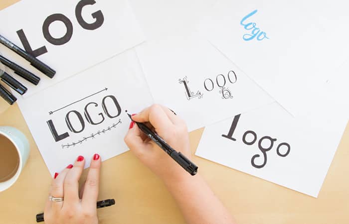
You may not realize it immediately, but every logo conveys a message. It is the symbol of your brand that should show what your brand stands for or what your brand values.
Do Research so Your Logo Conveys the Right Message to the Right Audience
Do Keep Your Logo Simple, but Don’t Make Your Logo Monotonous
Keeping your logo simple doesn’t mean boring and plain. Monotony can quickly destroy a brand or the positive perception of a brand. Take Google’s redesigned logos for Drive, Docs, and Gmail. Those have fallen under scrutiny even by loyal fans ever since release because they are monotonous. They all look the same and don’t convey any specific meanings.
You can keep your logo simple without it becoming monotonous by using negative space to your advantage, avoiding clutter, and ensuring every aspect of your logo conveys your brand’s message. That message can be about luxury, accessibility, youth, care, environmentalism, or anything else your brand values. It should be the essence of your brand wrapped up into one, simple image.
Don’t Follow Trends Otherwise Your Logo Conveys a Message of Weakness
Weakness may be a harsh term, but when you follow trends or when your logo is too trendy, it can easily get lost amongst your competitors weakening your branding goals.
However, you can follow good design trends like simplicity. But if mustard yellow is the color of the year or you use Open Sans for your logo because it’s recognizable, then you shouldn’t expect your logo to work for you. These are bad trends because they are either temporary or bland. Your logo conveys uniqueness, or at least it should.
Don’t Update Your Logo Too Often
Updating your logo absolutely should happen, but not too often. It’s a strategic decision, not a seasonal one. If you update too often, your logo loses its impact as people will no longer be able to recognize your brand when they see your logo.
Keep your logo simple, try out new and interesting designs, do your research, and don’t be too trendy or monotonous. Your logo should always convey your brand’s core values through its design.